Overview
Unfortunately, software architecture isn’t defined very precisely. It’s part of design and engineering. Martin Fowler defines software architecture abstractly as
the pieces that are difficult to change.
The best high-level understanding that I use frequently to judge an application or library is based on 3 views: people, data, and the stack. I believe going back and forth between these viewpoints helps a developer understand a solution deeply.
There are a lot of different ways to visualize architecture. In general, as long as the diagram tells a clear story, it is effective. The shapes must mean something consistent and the reader should not be overloaded with too many shapes.
Unified Modelling Language, UML, is a formalization of software design. It started in 1994. Version 2.5.1 was released as recently as 2017. There are a lot of good ideas for thinking about, explaining, and visualizing software design in UML. It’s important to follow what is already established so that other engineers can quickly understand and modify a software design.
There are a lot of tools that can generate or program using diagrams. Some visualizations don’t represent solutions very well. Also, there might be scaling issues. For example, auto generating a giant diagram from a big project may be very difficult without breaking it down further. It’s important that a developer keep multiple viewpoints in mind.
1. People
1.a. Foundations
People write software. Typically, software is an engineered product to perform some task. People train and communicate with each other to develop better software and software ultimately helps people. Therefore, it is important to understand the roles and organization of people in a solution.
All people cannot interact with everyone all at once. In algorithms, we call this scaling inefficiency n squared, where n is the number of people. Therefore, people have to communicate
- one to one
- many to many
- one to many
These are all meetings with different rules. The smaller the group, the easier to schedule ad hoc. Many to many is the trickiest to organize. One to many is a lecture. The process repeats and an organization is formed whether implicit or explicit.
2001’s agile manifesto favors
individuals and interactions over processes and tools
Manual processes are good. Tools are good. But individuals and their interactions between them are better.
A manual procedure is only as good as the people who follow it. If people do the right thing, then no formal procedure is necessary. The best tool is meaningless if no one knows about it or if no one knows how to use it.
In 1967, computer scientist, Melvin Conway famously said
organizations which design systems … are constrained to produce designs which are copies of the communication structures of these organizations.
This idea has been called Conway’s law. As we group people, we group functionality. For example, a database and a frontend team will design a database and a frontend module. If the team was split differently, they may design the modules differently. If that team was split into a form handler and a music player team instead, then they would have a form handler module and a music player module.
1.b. Org Chart
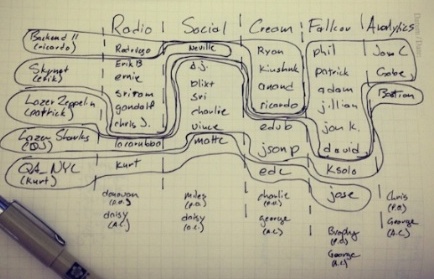
Some organizations balance customer needs and functional needs directly using a matrix organization. For example, Harris Corporation has groups for business segments and engineering segments where engineers are in multiple of these groups. Also, Spotify has a similar structure, although it’s a little more free form. See the org chart below.

Here the vertical section is the feature. In Spotify’s case, the feature often correlates to a front end component. The horizontal section roughly correlates to technical functionality. For example, the backend and QA teams are on the horizontal section. Note that employees are in one feature group, but sometimes employees are in multiple horizontal groups.
The previously mentioned organizations are more complicated in that they have multiple groups that have to interact. Each group is meant to have some autonomy, but they need to negotiate with the other groups. In some cases there may be no leader in these groups. Another approach is a simple, strict hierarchy like the military. A good example org chart is the U.S. army as seen below.

Top down organizations are simpler and more directed. They can be more responsive to large issues. The person at the top is accountable. On the other hand, the person at the top may also be the least informed, if the information doesn’t trickle up.
We see similar organizational structures in the open source language design world. Python used to be structured with the benevolent dictator for life, Guido van Rossum, at the head. He also coined the phrase, benevolent dictator for life. On the other hand, C++ has a committee at the head.
1.c. Proximity And Communication Channels
There’s different ways to view the organizations beyond an org chart. There’s also a seating chart. There are a few different general office seating arrangements
- closed
- shared
- open
Closed offices are where each employee has a private office. Shared offices have a few people in one room. Open offices are more popular now. In an open office layout, almost all employees are in a large room.
Then there is also how often seating arrangements change. There’s no way an employee will only work with the people directly around him or her. In an open office it may be better to force a shuffle periodically. Typically, managers spend a lot of time figuring out who sits where. In reality, it doesn’t matter. Even if someone is less than 50 feet away, it might be better to communicate via email. In that case, they might as well be remote. Instead of seating charts, maybe slack channels like the one below are more important.

2. Data
2.a. Parsed Data
Fred Brooks famously states in 1975’s Mythical Man-Month
Show me your flowcharts and conceal your tables, and I shall continue to be mystified. Show me your tables, and I won’t usually need your flowcharts; they’ll be obvious.
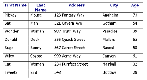
Just viewing what data a company collects explains the product and what the software is capable of doing. For example, see the table below. Just by viewing the database table, it is clear that the software stores customer information. The information may be used for demographics or for mailing.

2.b. Data Flow
How data flows throughout a system is one of the best ways to think about a software product. The best diagram to visualize a data flow is aptly named a data-flow diagram. See the example below. We can see that images are uploaded through an Image Request Handler. Then, files are written to the Image File Storage. Clients send a request to the same Image Request Handler and the Image File Storage returns the image.

It’s important to note that the data-flow diagram has no control flow, no decision rules, and no loops. If it did, it would be a flowchart. Also, note that data-flow diagrams are not UML. There is something similar called activity diagrams in UML. An activity diagram is a standardized flowchart. In data flow diagrams the lines between boxes are data. Data-flow diagrams might not be sequenced directly based on the lines. In activity diagrams the lines transition between activities. The lines do indicate the order of operations.
See the example below. Note that there is a decision point, which a data-flow diagram doesn’t allow, represented as a diamond. Start is a closed circle, activities are the rounded rectangles, arrows are the control flow, bars represent the start or end of concurrent actions, and the enclosed circle is the end.
Data flow can turn into programs directly in visual programming languages. The program below is from weather station software in Node-RED. The bluetooth sensor passes in the temperature, the temperature goes through a function. Then, it is plotted and recorded.

2.d. Concurrency
When the timing between different actors is relevant, it’s best to use UML’s sequence diagram. For example, a client and server may process different data asynchronously like the example below. The boxes at the top are the actors. In this example, they are different physical machines. The dotted line below them are their lifetimes. The start message appears from the filled in circle. The filled in arrow is a synchronous call. The thin box on the dotted line represents a task being processed. Dashed lines represent reply messages.
2.e. State Machine
It’s hard to avoid state machines when discussing software design diagrams. Usually, they are a design detail. That being said, UML has us covered here as well.
See the simple state machine below. It represents creating an opened door and then interacting with it. The filled in circle is the start. The arrows are the transitions. The rounded rectangles are the states.
Yakindu is a proprietary tool that can convert state machine diagrams into text-based programs. It targets the embedded market.
3. The Stack
3.a. Overview
I left the rest of the views for what people often call “the stack.” It includes the dependencies and APIs available. Instead of data flowing, it centers around the construction of the software itself.
3.b. Dependencies
It’s important to package internal and third party software in ways that make sense. It must be practical from a build and release point of view. Also, the packages must be worth maintaining either internally or as a third party.
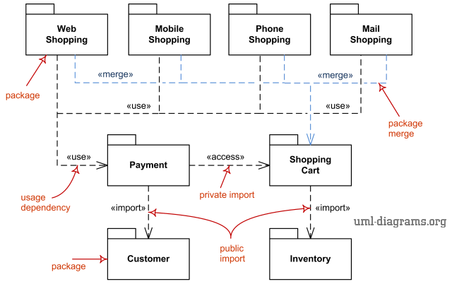
UML does provide a package diagram. See the example below. In the example The Web Shopping package uses and therefore depends on the Payment package. The Payment package accesses the Shopping Cart, which the Web Shopping package does not depend on or access directly.

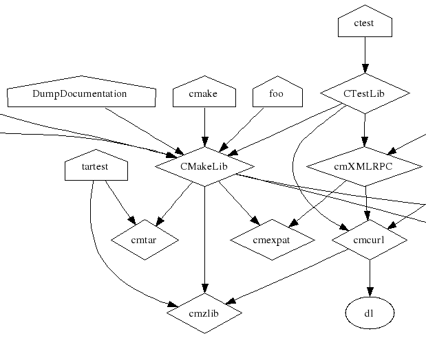
I find that UML’s package diagram is too complicated. Instead, I like simpler diagrams like CMake’s Graphviz. See CMake’s Graphviz output from part of the CMake project below. The executables are house shaped. The arrow indicates a dependency. The diamond is a library. The circle is a precompiled library. There’s only four types of shapes and it directly relates to the actual project.

3.c Call Graph
A call graph can be used to understand what component calls what components. It is very low-level. It is like a dependency graph, but each dependency is a function call. Call graphs can be generated in doxygen.
Here’s some simple code below.
/// \file
#include <cstdlib>

/// \brief add
/// \return double
double add(const double a, const double b) {
  return a + b;
}

/// \brief multiply
/// \return double
double multiply(const double a, const double b) {
  return a * b;
}

/// \brief main
/// \return int
int main() {
  const double added = add(1, 2);
  const double multiplied = multiply(added, 2);
  return EXIT_SUCCESS;
}
and here is the accompanied CMakeLists.txt
cmake_minimum_required (VERSION 3.5)
project(doxytest)

find_package(Doxygen
  REQUIRED dot)

set(DOXYGEN_CALL_GRAPH YES)
set(DOXYGEN_HIDE_IN_BODY_DOCS NO)

doxygen_add_docs(doc main.cc)

add_executable(main main.cc)
Running make doc will generate docs that will produce a call graph like below. Note that we see the calls, but we don’t see what data is being passed in and what happens to the data as it is returned.

3.d Class Diagram
The de facto standard for object oriented design is a class diagram. Most developers do not know how to create or read them. In truth, they are another design detail. They are typically too low-level to be used in a general way.
See the classic, simple example below. The name at the top is the class name. The empty section in the middle of each rectangle indicates that no class has member variables. The declaration of the draw method is at the bottom. The plus means that the method is public. The colon void means that the method does not return anything. The arrows from the top of the class to the bottom of the class indicate a child to parent relationship.

Some programs like StarUML have extensions to convert back and forth between text based languages like C++ and UML class diagrams.
Other programs like doxygen can generate inheritance diagrams or collaboration diagrams. Observe the class definitions specified in the listing below.
class A { public: A *m_self; };
class B { public: A *m_a; };
class D;
class C : public A { public: D *m_d; };
class D : virtual protected  A, private B { public: C m_c; };
See the image below for doxygen’s collaboration diagram for class C. class C inherits from A publicly. Also, class C has a pointer to a class D instance. This diagram is very complicated, but it is nice that it directly relates to code.

